They were an older couple and made an apartment from the top floor of her daughter’s home. They took the largest room upstairs, turned half into a living room and the other half for the kitchen. This enabled me to stand in living room and capture a good shot of the whole kitchen. Few projects are like that and it’s one of the reasons I have this photo displayed on the gallery of our website.
They had thought long and hard about how they wanted it laid out and he, having been an engineer, drew the floor plan. They also said it was to be very modern and blond in color. I’d love to take sole credit for the design of this beauty but, I’m happy having gotten the job amongst three bids (and simply helping with it’s design).
Here is the room all prepped before installation…

 As all the cabs had toe-kicks, we built our bases (2X4’s), leveled them and began placing each cab in place.
 My son, Brian, working on the island (notice the quarter-round glass shelves on left)
 Notice the roof pitch (ceiling slant) that required we make cabs with slanted tops to which the crown molding had to be wrapped at an angle. The ‘crown’ was simply ‘one by’ material so we increased the height of the piece on the face compared to the side runs. My elder son (Russell) is contemplating something in the background.
 Here is the first picture after completion. You’ll notice the island’s counter made of contrasting strips of hardwood. You can see the stove top’s highly stylized vent hood. It was important to get a beauty because it was so prominent.
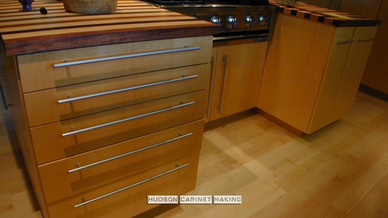
 Here is a shot of the island from behind. We maintained a continuous veneer for the doors and drawer fronts in a clear finished maple. All were mounted over-lay with long, thin chrome pulls.
 Here you can see the left side of the kitchen and the effect of the glass shelves (which are on the right side as well).
 The cabinets on the far right and left are open shelved from behind, though you can barely see it (opposite the fridge). The coffee maker, toaster, can opener, etc. are there for easy access. This frees up counter space and keeps the kitchen looking clean and orderly. Our client is in the background. ( I interrupted her making dinner when I stopped by to photograph)
 This makes a handsome master shot. The track lighting is very cool looking and if I’d had a slightly wider lens, I could have shown the glass shelves on the right and left sides. Maybe I’ll go back and photograph the kitchen again some day. Might even make a nice, short film for the video page on our site.


You must be logged in to post a comment.