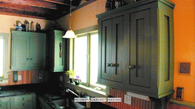
Here is a kitchen we built for, what was an old school house (1860).
 This above photo displays the strong, simple detailing we incorporated. We increased the width of the frames for the doors, drawer faces and side walls which leaves a slightly smaller panel in each of their centers.
There is no molding profile on the inside edges of any of the frames. The fact that every face (surface) on the cabinets are frame and panel is enough decoration by itself.
The ‘fireslate’ counter tops were left square on their outside edge. These are the counter tops we all had in our high school science labs.
The wall cabinets possess the same detail with the addition of hand-made support brackets (corbels) and the cabinet’s top edges are finished with two, staggered square trim pieces (to act as a crown).
 On an opposite wall we included a small unit for cookbooks.
The island’s counter top we made from rock-maple planks ( looks so much better than commercial butcher block). A refuse bag sits beneath this opening cut into the surface. We used over-sized legs (6″ X 6″) to support the counter’s cantilevered (over-hung) edge which creates an area to sit along one side of the island.

 The Old School House has just received Historic Landmark Status. I’m pleased we were asked to maintain it’s authentic character… and I love the way it turned out.
 Russell Hudson / Hudson Cabinetmaking, Inc.


Which came first – your kitchen or this kitchen? I know you did an ‘old fashion’ kitchen a while back. Is this it, or is this a new job that you just completed?
In any event, it is very pleasing to look at and I’m sure in person it’s even better. I still love my kitchen the most, but I’m very partial. You are truly a genius as you create the kitchen to suit the location as well as the owners of the home!
that’s because I designed your kitchen specifically for you, my dear
Perfect fit for the house theme. the corbels, maple countertop and overall attention to detail stands up and out. Beautiful work.
OUTSTANDING !
As always, your attention to the finest detail shows exquisitely!
Another beautiful kitchen. When I am ready to do my kitchen over, I will call you. The shaker look is not right for my house, but I appreciate it’s beauty and craftsmanship.
Very often successful complex designs are easier to accomplish than a suitable simple one. I think you hit the mark. Being simple myself, the straightforward design is especially appealing! Ray
I love the simple elegance of this kitchen. I think the fire slate counter top looks great as does the maple top for the island. The shot of the bare beautiful old wood floor, particularly in the work area reminds me of a blog I wrote about protecting the wood from water, spills etc. You can check it out on my blog at http://www.hudsonfloorscapes.com.
Great work……….
I live in Texas and my son showed me this site because we are redoing our kitchen. I love the cabinet color of the “Historic Kitchen,” and I wondered if it might be possible to get the name of the color and the brand. Thanks.