We’ve come up with quite a few small home bar designs over the last 30 years but this client asked us to establish a rich, classic look for their ancient (230 year old), two story stone house. It’s location was in an older, upscale section of town. Many of the interior doors had been imported from European estates. Their panels decorated with hand-carved relief.
Their contractor had used us for some very high-end work before and knew of our skills. We were to create cabinetry for a large master bath and likewise for a built-in wet bar in a niche on the opposite wall from the main fireplace in their living room . I told them I’d like to see a piece that looked like it had been there for a hundred years or more. What you might see in a very old, private, country club, for instance.
Although we do modern design work when asked to, I particularly enjoy creating a classical look, of woodwork from a bygone era. I love dark greens, copper counter tops and the look of well made, antique furniture. …so I finally found a small magazine photo (of the kitchen in Cameron Diaz’s Manhattan apartment), that would help them visualize the direction I was aiming for….
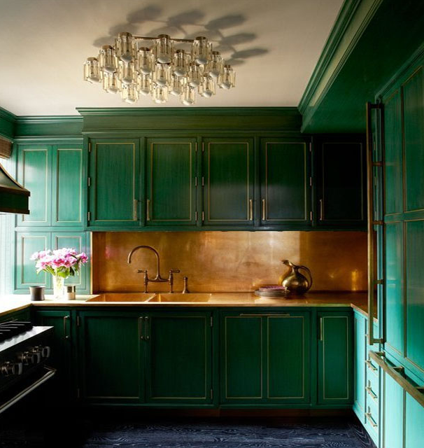
Next I had to plan the configuration of cabs, both for function and ‘old world’ appeal…

original wet bar rendering with amendment notes / a small refrigerator was to exist behind the lower right door(s)
I found another pic of a well worn antique piece. I wanted this bar to look like it had existed in their home for over a century (even upon close inspection)…so I showed them the kind of aging I thought best.

After much experimenting, I came up with a finish sample that really looked authentic. On some scraps of poplar wood, I stained (to a medium brown) and then painted over with a beige color. I did this to all those exposed edges that I intended to appear as ‘worn through’. Then I painted over everything with a dark Hunter green. Next I sanded those edges, through the top coat, to expose the stained wood beneath, showing a thin line of the beige existing between the stained area and the green top coat. Then I covered the the whole surface with urethane. We had our painters do this work but I had established exactly what the finisher would do to get the look I achieved in the sample. As well, we used hand-rolled glass to give it yet more ‘aging’ and help obscure those objects stored behind.
Here are two extreme close-ups to explain what we really did and then progressively wider shots to show the over-all (more subtle) effect it gave.


this hand rolled glass has random air pockets and is closer to how old ‘seeded’ glass looked
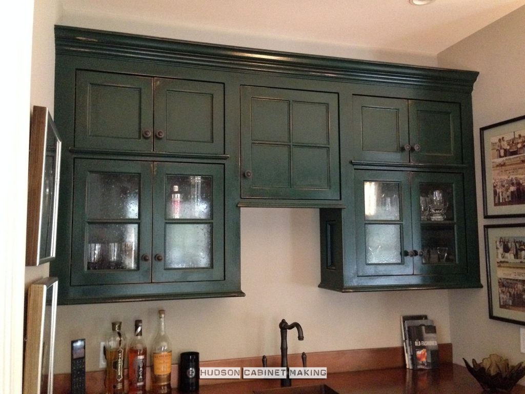
LED lights were hidden beneath left and right sections
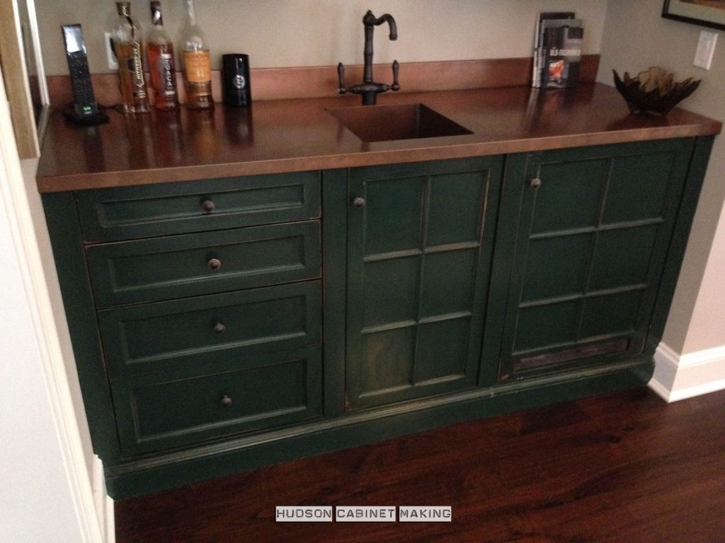
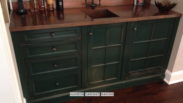
a copper grate was created in the lower right door to help hide the fridge / sink was created as an integral part of the counter top.

a home’s wet bar… made to appear ‘vintage’. Over-all effect looked very authentic.
I’m adding this last shot because it shows the copper counter best.
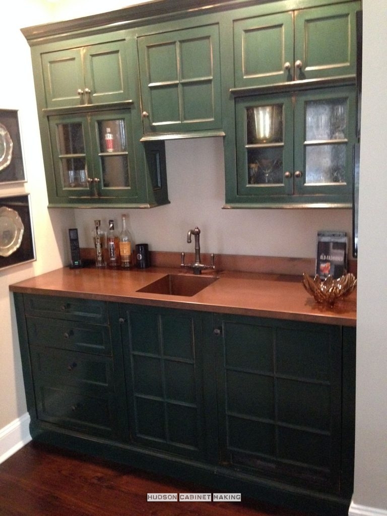
The copper is unfinished so it will age further. It’s known as a ‘live’ finish.
Now I have another ‘small home bar designs’ photograph I can show clients.
Russell Hudson / www.hudsoncabinetmaking.com
You must be logged in to post a comment.